

Objective Wellness
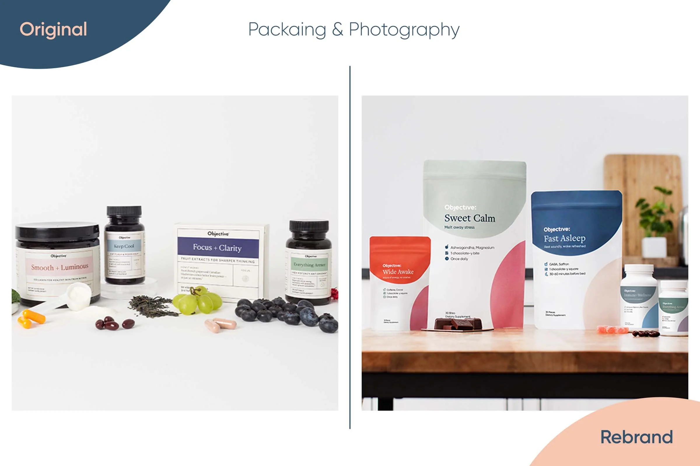
This Clorox brand was the initial creation of a supplement line to compete in the Olly, Ritual, and care/of space. Unfortunately initially it did not get the traction that we knew was ultimately possible, so it was time to rethink and reimagine what Objective could be. The rebrand/refresh took approximately 6 months and was fully encompassing from site, logo, colors, packaging, look and feel as well as a total tone of voice facelift. What once had busy emails and bland packaging soon had the color and sophistication it needed.
Using a refreshed logo that is easier to read yet intentional with the design choices really helped breathe new life into the brand. The ‘tittles’ from the tops of the j and i animate to form the colon at the end of the logo, opening up a conversation for any part of the day: What is your objective? Whether it be sleeping better, antioxidant support or simply indulging in a relaxation filled bite of chocolate midday, your objective is our Objective.
The photography really made the packaging feel like they actually belonged on your kitchen counter or in your cabinet, and better yet if you saw them you wouldn’t be upset they were there. The original packaging left a lot to be desired, but at the end of this journey we ended up with a charming yet friendly colored, toned, and curated brand that was allowed the unique product offering a real chance to prove its worth to consumers.


Concept/Art Direction: Cole Lemaster
Animation: Kyle Barber


